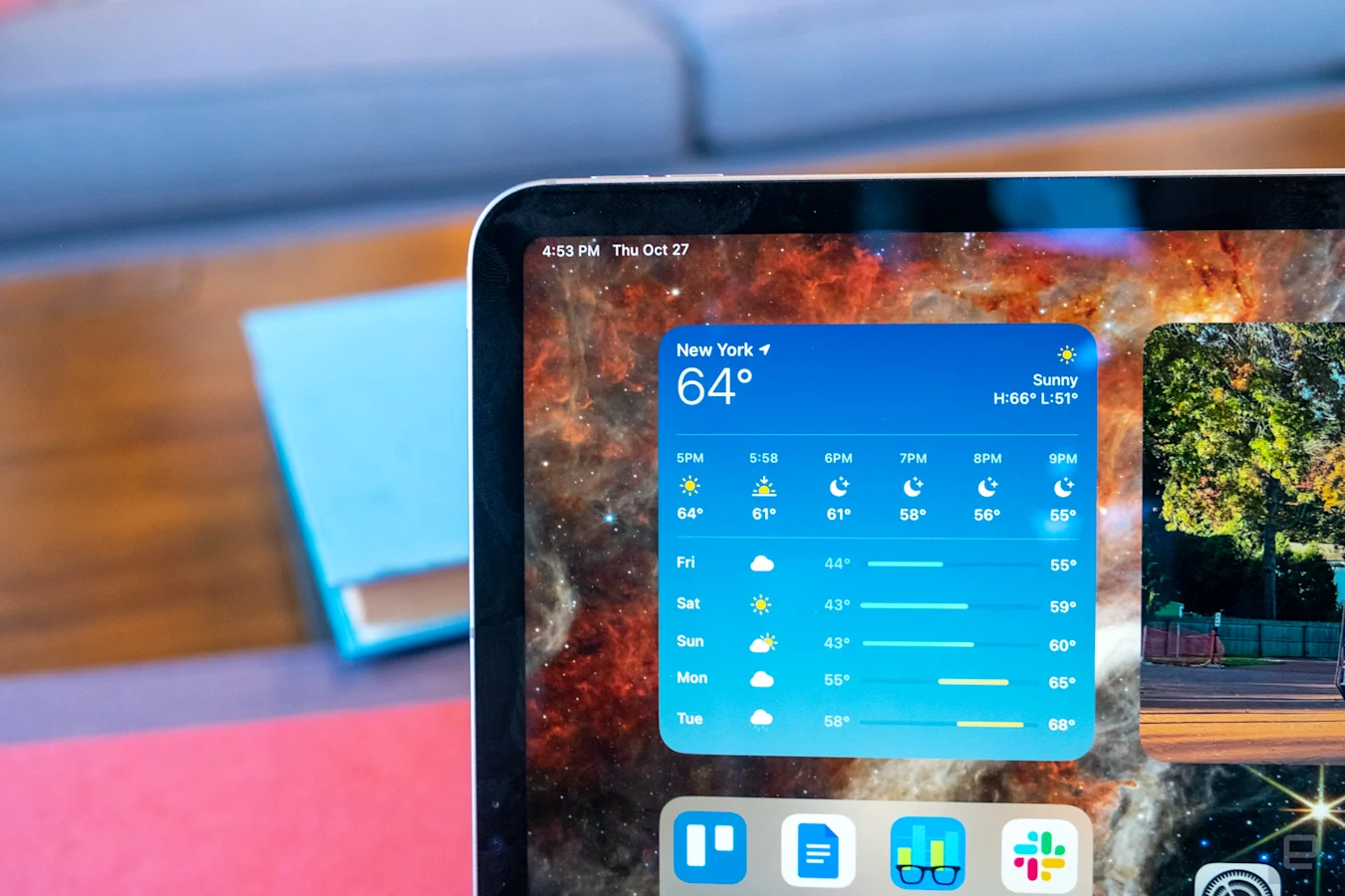
Apple just released two new iPads. One of them, the basic 10th-generation iPad, was rebuilt from the ground up. The new iPad Pro, on the other hand, is a much simpler update. The company took last year’s model, swapped the M1 chip for the M2, made a few other small tweaks, and called it a day. The iPad Pro is still ludicrously fast, and it’s still extremely expensive, starting at $799 for the 11-inch model and $1,099 for the 12.9-inch.
I can’t really fault Apple for this approach, though. Even though the basic design of the iPad Pro was first introduced in 2018, it’s still a marvelously engineered piece of hardware. It features one of the best screens Apple has ever made, and it continues to surprise me that the company can pack so much power into such a compact frame.
Pros
- M2 chip is incredibly powerful
- Great battery life
- Screen and industrial design are still best-in-class
- Handy new Apple Pencil Hover feature
Cons
- Awkwardly placed front camera
- Stage Manager isn’t fully baked just yet
While this year’s model closely resembles what Apple was already selling, it does arrive at a significant time for the iPad’s evolution. That is thanks to iPadOS 16, which launched last week. For most iPads, it’s the expected collection of useful improvements — but for the iPad Pro, it offers an entirely new multitasking system called Stage Manager. It’s a clear response to the question we tech reviewers (and many iPad Pro owners) have been asking for years: When will we get software that lets us take advantage of the iPad’s power?
Gallery: Apple iPad Pro (2022) review photos | 10 Photos
Gallery: Apple iPad Pro (2022) review photos | 10 Photos
Hardware
First, a quick refresher. The iPad Pro is still available in two sizes: 11 and 12.9 inches. Storage options range from a modest 128GB up to a truly outrageous 2TB, and you can configure it with an optional 5G radio for when there’s no WiFi. And for when you’re at home, it supports the WiFi 6E, whereas last year’s model was limited to WiFi 6. As usual, we reviewers get to play with a near top-of-the-line iPad: the 12.9-inch model with 1TB of storage and 5G service from Verizon. This iPad Pro costs a jaw-dropping $1,999, and that’s before you add on the $129 Apple Pencil and $349 Magic Keyboard. We’re well into MacBook Pro or Mac Studio territory at this point.
At least the iPad Pro still feels like a device worth that kind of money. (Whether it is is a different question.) The fit and finish remains exceptional, and while the 1.5-pound weight makes it a bit more of a burden to hold compared to smaller and lighter iPad models, I’m still impressed at Apple’s ability to cram such performance into a device that’s so compact. There are other well-designed tablets on the market, but I still don’t think anyone has caught up to the iPad Pro.
The 11-inch model still has to make do with the same Liquid Retina LCD display it’s had for a few years now, but the 12.9-inch version has the Liquid Retina XDR panel that was first introduced on the M1 iPad Pro in May of 2021. This screen uses mini-LED backlighting to offer 2,596 local dimming zones to offer a wide dynamic range and a 1,000,000:1 contrast ratio. It also has up to 1,000 nits of full-screen brightness and 1,600 nits peak brightness when playing back HDR content, which can really make movies pop.

Nathan Ingraham / Engadget
There’s nothing new about the screen this year, but it’s worth highlighting just how good it is. Both iPad Pro models also have the 120Hz ProMotion refresh rate; support for the P3 wide color gamut; a screen that’s fully laminated to the front glass; and an anti-reflective coating.
Just like last year, the iPad Pro has an ultrawide 12-megapixel front-facing camera that supports Face ID authentication. This wide-angle camera supports Center Stage, which crops and zooms around your face to keep you in the middle of the frame on a video call. That’s all well and good, but unfortunately the iPad Pro still has its front-facing camera on the portrait edge of the screen, which means you’re always going to be somewhat off-center and not looking directly at the screen if your iPad is in a keyboard dock. This has been true of all iPads for years already, but now that the basic model has gotten a landscape-oriented camera, we’re going to be waiting impatiently for Apple to implement that across its entire lineup.
The back cameras are also the same: There are 12-megapixel wide and 10-megapixel ultra wide options, along with a flash and LIDAR scanner. However, the M2 processor unlocks a new video trick, as the iPad Pro can now record video in Apple’s ProRes codec in 4K resolution at 30 frames per second, a feature first introduced in the iPhone 13 Pro. This is admittedly something of a niche feature, but it shows off the M2’s improvements over its predecessor.

Nathan Ingraham / Engadget
Accessories
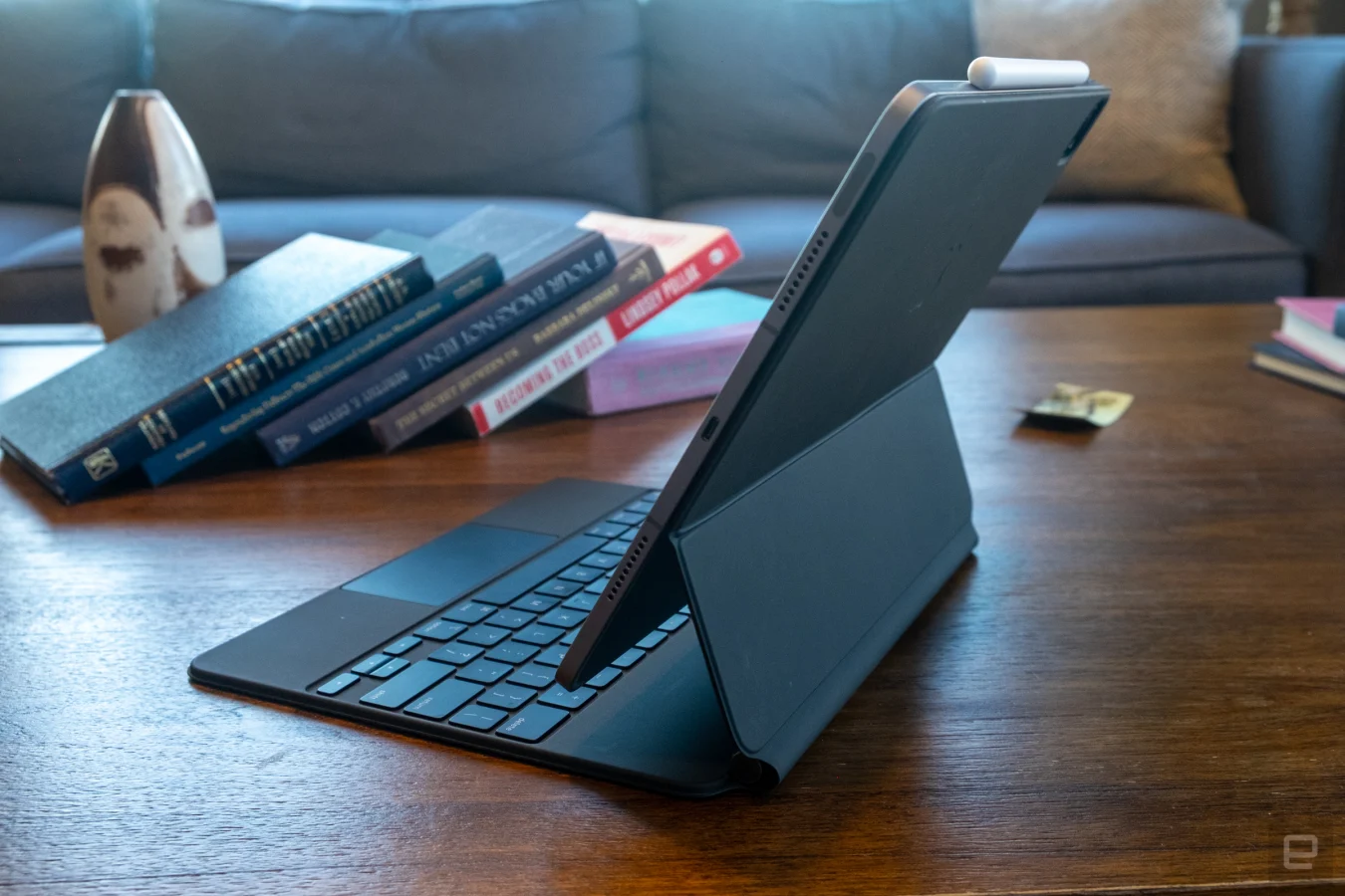
From an accessories standpoint, the iPad Pro uses the same 2nd-generation Apple Pencil and Magic Keyboard that have been available since 2018 and 2020, respectively. The Magic Keyboard still provides the best typing experience you can find on an iPad, though the whole package is pretty heavy. It’s also crazy expensive, as I already mentioned. And now that the basic iPad’s new Magic Keyboard Folio offers a row of function keys and a slightly bigger trackpad, I’m really missing those features here. But if you make your living with words, as I do, it’s still an essential tool.
The Apple Pencil remains a tool that I’m not particularly great at evaluating, because I am sorely lacking in visual arts skills. I sure wish I could sit down and sketch and doodle and make the wonderful creations I’ve seen others do, but that’s not happening. If you’re a visual artist, chances are you already know how well the Pencil works, though.
The M2 on the new iPad Pro also enabled a new trick called Hover. If the Pencil is within 12mm of the screen, icons and interface elements can react to it. The most simple example is how app icons increase in size when you hover the Pencil over, showing you what you’re about to tap on. This works system-wide, at least in Apple apps. Third-party developers will have to build Hover features into their apps, but it should be a nice new tool in the Pencil’s arsenal. One place I was able to demo it was in the Notes app; when using the new watercolor brush, you can hover the pencil over the screen to see how the color will react with other elements you’ve already drawn.
I found another cool Hover implementation in the excellent image-editing app Pixelmator Photo. Hovering and moving the Pencil across a strip of different filters at the bottom of the app automatically applies them as a preview. It’s wickedly fast and a fun way to see what your picture will look like. That said, it’s something you could already do with the trackpad and pointer; so far, a lot of Hover actions I’ve seen are straight up clones of what you can do when hovering over an interface element with the trackpad. I’m looking forward to seeing what developers come up with going forward, though.


