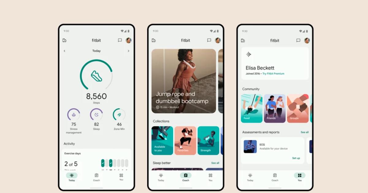
The official Fitbit app is getting a major redesign with an emphasis on simplicity, personalization and motivation. The refresh splits everything into three tabs, to reduce visual clutter and make it easier to use. There’s the Today tab, the Coach tab and the You tab, each offering access to unique metrics and activities.
The Today tab collects all of your preferred stats and metrics so you can check everything out at a glance. This is fully customizable, so change up the displayed stats to suit your personal goals. Though called “Today”, you also get a bird’s eye view into health trends over the past month or year, via charts, graphics and icons.
The Coach tab is all about motivation, with curated lists of workouts and mindfulness sessions. You can filter these workouts based on your availability, owned equipment and overall fitness and health goals. Fitbit Premium subscribers can access more content than free subscribers, such as dance cardio classes.
Finally, there’s the You tab. This is where you access your achievement badges and various progress metrics, in addition to connecting with other Fitbit users and changing up personal information. The company says everything here is kept private and won’t even be leveraged for Google ads data.
It’s worth noting that the refresh will not change which features are free and which are only for premium subscribers. The redesign is already going out to select Fitbit users as a beta product before the global launch this fall. There are more changes coming to the platform in the future. Starting next year, users will have to login to Fitbit apps with Google credentials, as the Fitbit brand is being phased out.


