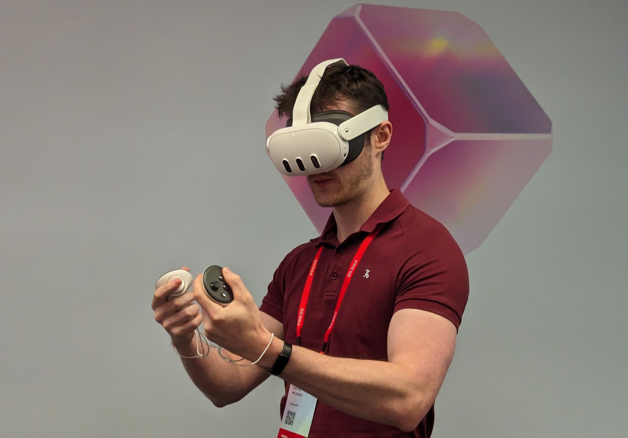
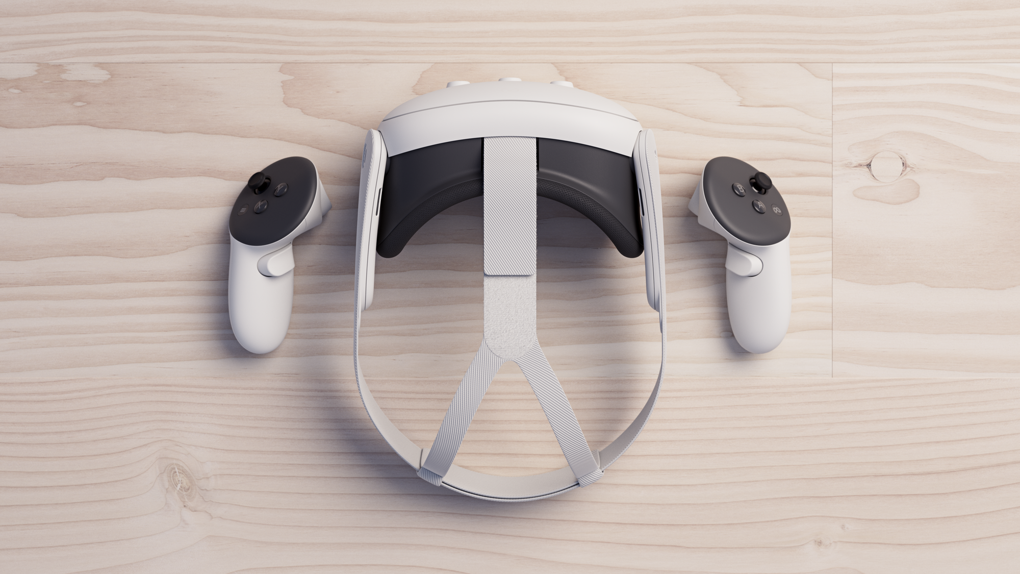
At Meta Connect I went hands-on with Quest 3.
Quest 3 is a significant improvement over its predecessor on paper, with a 40% slimmer visor, pancake lenses, next-generation chipset, color cameras, depth sensor, and more. With its mixed reality capability, it even promises to deliver entirely new kinds of experiences not possible on Quest 2.
Quest 3 Specs, Compared To Quest 2 & Apple Vision Pro
Read the full confirmed specs of Quest 3, including a comparison with Quest 2, Quest Pro, Pico 4, and Apple Vision Pro:
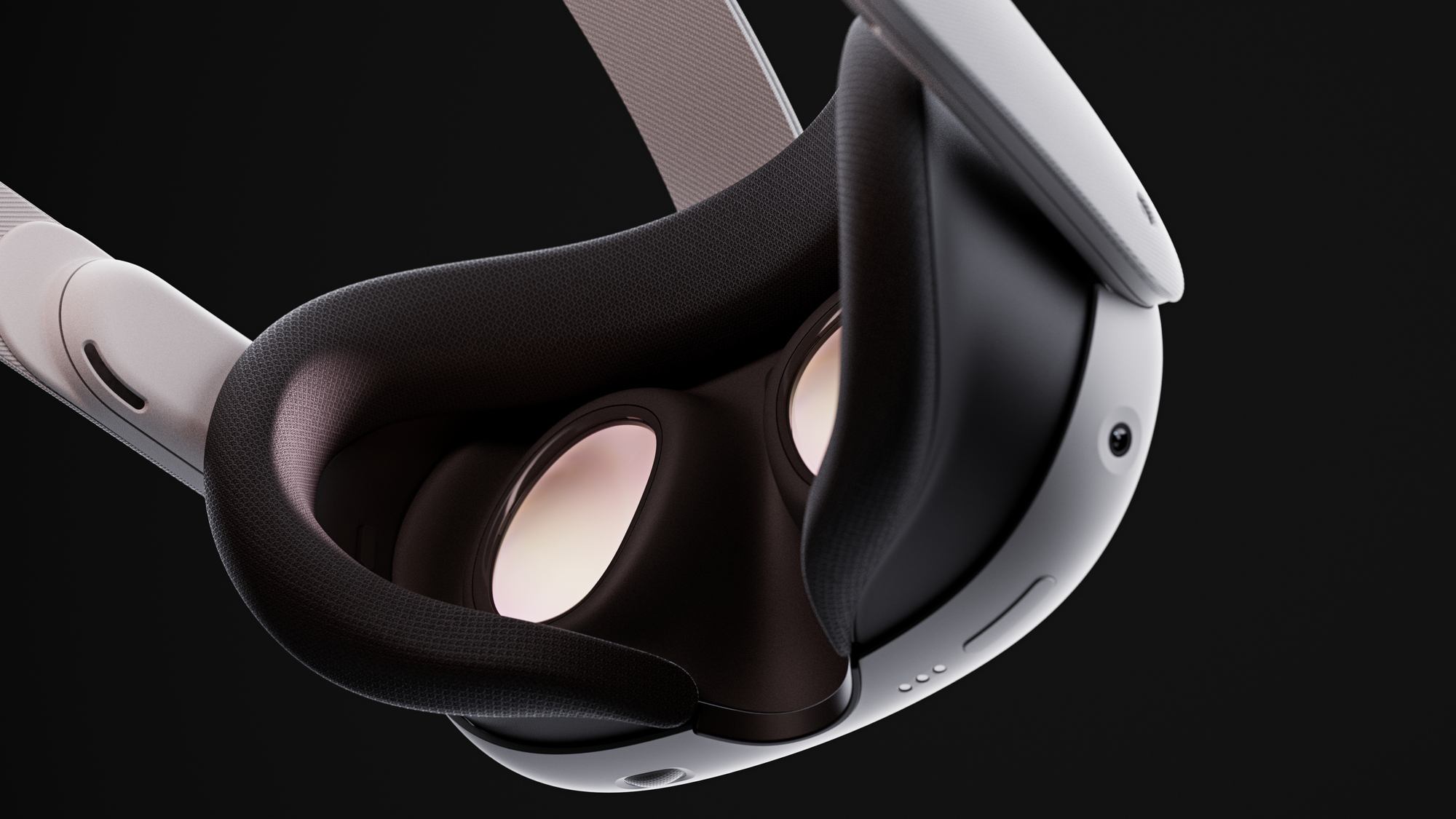
But as I’ve learned from many years of trying dozens of face computers, on-paper specifications tell only a small part of the story. The only way to truly assess a headset is to actually try it. So how was it?
Weight & Comfort
As soon as I put Quest 3 on my face, I was surprised at how light and comfortable it felt, even with the default flimsy cloth strap.
Quest 3 is actually ever so slightly heavier than Quest 2 – 12 grams heavier to be precise. But in this new age of slimmer headsets enabled by pancake lenses, raw weight is becoming an almost irrelevant statistic when comparing to fresnel lens headsets because Quest 3 feels lighter.
As a thought experiment, if Meta had decided to lie and tell the world Quest 3 was actually lighter, I suspect anyone trying it would have believed them. That’s because what we really perceive is the rotational force (moment) of a headset, which is determined as much by the center of mass as the total weight – and Quest 3’s is much closer to your face.
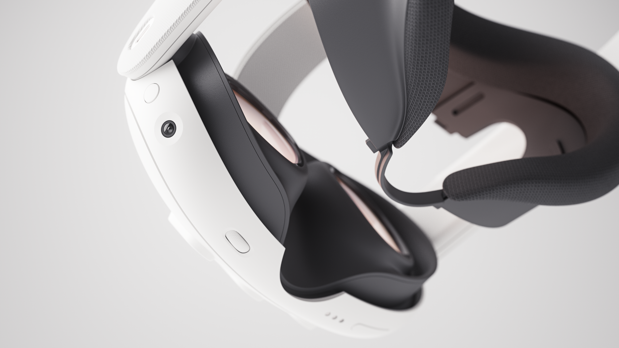
Quest 3 also has a more comfortable default facial interface made of a softer, gentler kind of foam, which was a very welcome change given how much I hate the cheap-feeling face-hurting harsh material of Quest 2’s.
Glasses wearers will no longer need to use a spacer insert and awkwardly shove their frames into the headset, as by just pulling on either side of the facial interface you can adjust the distance from the lenses to your eyes, with four fixed distances possible. I don’t wear glasses though, so I kept it at the closest setting to maximize the field of view.
Of course, 20 minutes is not nearly enough time to truly assess a headset’s weight distribution and comfort. But I’ve often argued that Quest 2 should have come with the Elite Strap because of just how uncomfortable the default strap is, which I noticed after a matter of seconds, and I had assumed I’d feel the same way about Quest 3. But at least for short sessions, the default strap felt fine.
Passthrough & Mixed Reality
Passthrough on Quest 3 is much improved over Quest Pro – and lightyears ahead of Quest 2 – but it’s still far from feeling like a transparent optic.
The latency is impressively low and felt almost imperceptible for static objects – Qualcomm showed a demo of playing ping pong with XR2 Gen 2 reference headsets, for example.
The passthrough on Quest 3 has three times more pixels than on Quest Pro and ten times more pixels than on Quest 2. There’s still some graininess, but far less than Quest Pro. You can make out fine details in your environment including the facial expressions of other people in the room, notifications and messages on your phone screen, and relatively small text printed on A4 paper.
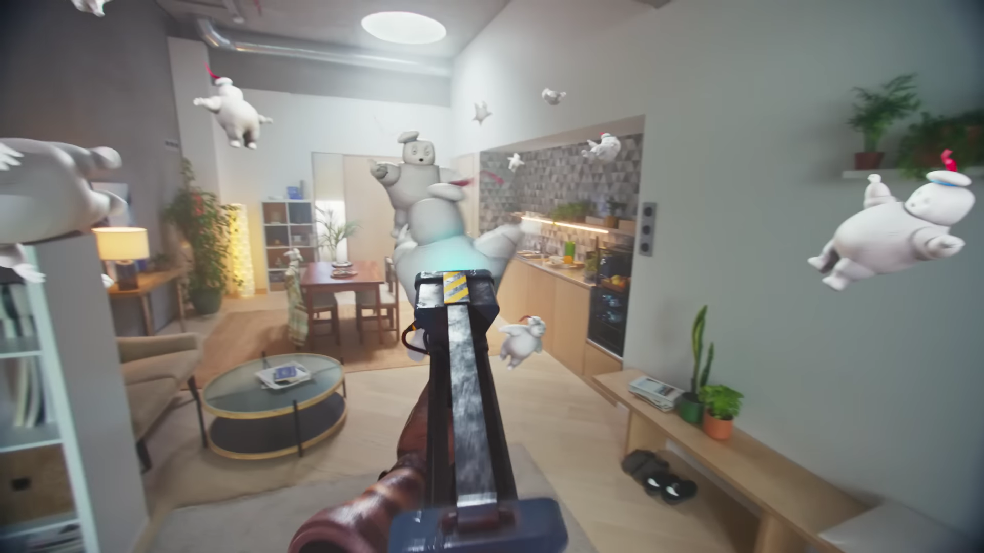
Further, whereas screens and other bright regions in your view are blown out on Quest 2 and Pro, Quest 3 dynamically adapts the exposure in real-time to prevent this. In another demo, my colleague Ian Hamilton even looked out a physical window to see the outdoors while playing a mixed reality game indoors.
The depth and scale of the passthrough locked in perfectly in the mid and far field, but the system still struggles in the near field and in your periphery. When you bring objects very close to your face, you’ll see geometric warping distortion which makes your phone look curvy rather than straight edged for example – but again, this warping is significantly reduced compared to Quest 2 and Pro.
The other issue in the near field is ghosting. While Quest Pro’s passthrough is really just black & white with a delayed color layer jankily added on top, Quest 3’s passthrough is true color, which looks & feels much better. However, there’s still some double-imaging on moving objects or hands nearby. It’s much more subtle than it was on Quest Pro, but it’s still present, including on your hands and arms, and this is the biggest weakness of the Quest 3 passthrough experience.
Ian tried Apple Vision Pro back in June, and he tells me this wasn’t an issue with it. With Vision Pro, he said he truly felt the hands he was seeing were his own, whereas the ghosting effect on his hands on Quest 3 meant he didn’t feel this at all. Of course, Vision Pro has a secondary chipset specifically for passthrough and costs seven times more.

So that’s the passthrough quality, but what about the mixed reality virtual objects in your space?
Like Quest Pro, the positional tracking is rock solid, so virtual objects feel truly anchored to your real environment with no jittering, drifting, or floating. The new environment 3D meshing capability means objects can attach to or move along walls, floors, and furniture with no visible offset. They can even cast shadows, adding to the feeling they’re there.
But the big downside of mixed reality on Quest 3 currently is that it lacks dynamic occlusion. Yes, virtual objects can appear on or behind furniture and other static objects can be scanned when you start playing. This is a big step up from the room setup of previous headsets which had you manually draw crude rectangular cuboids. But these virtual objects are still rendered in front of your hands, arms, and other people, even if they should really be behind them.
This lack of dynamic occlusion was jarring – especially given it means virtual objects are rendered in front of your hands – and it completely broke the illusion of those virtual objects really being there in front of me. Meta will be adding dynamic occlusion as a software update later this year – but it’s a huge shame it won’t be there at launch.
Lenses, Resolution & Graphics
The triple combination of the twice as powerful GPU, higher resolution displays, and state-of-the-art pancake lenses deliver a truly generational increase in sharpness and graphical fidelity in VR apps and games.
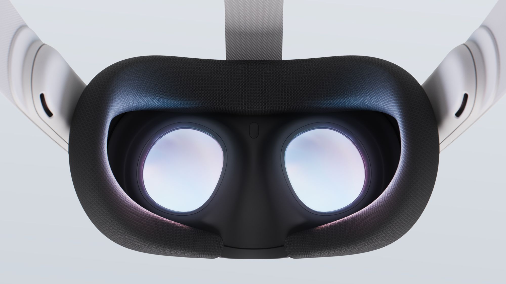
Those who upgrade from fresnel lens headsets like Quest 2 will wonder how they ever tolerated the blurriness by comparison, and those coming from any other standalone headset will wonder how they ever found those graphics acceptable.
For example, Red Matter 2’s developer increased the rendering resolution from a fixed 1226×1440 dynamically up to 3322×3519, replaced 1K textures with 4K textures, and added dynamic shadows with high-quality shadow filtering to grabbable objects.
In my demo, I could hold down a button to toggle between Quest 2 mode and Quest 3 mode in real-time. I was completely blown away by how much better it looked – far closer to what I’m used to on PlayStation VR2 than gaming on Quest 2. It was refreshing to no longer see the constant shimmering and aliasing I’m used to from standalone headsets, and to actually be able to see fine details in objects I picked up, as well as text in menus to be legible.
Quest 3 Gameplay Videos Show Significant Graphics Upgrades
Watch side-by-side comparisons showing the significant graphics upgrades game developers can deliver on Quest 3:

I also tried Assassin’s Creed Nexus, Ubisoft’s first AAA VR game set to launch in November. While I haven’t tried this on Quest 2, I seriously doubt it could handle the draw distance and sheer number of NPCs I saw in the Quest 3 build, making Venice’s relatively open-world city feel truly alive. Meanwhile, the Walking Dead Saints & Sinners’ developer already confirmed they were able to increase the number of zombies.
The difference in what developers can achieve on Quest 3 is so extreme I’d argue the new chipset is the single biggest hardware upgrade, more important than even the lenses or improved sensor suite. Meta is mainly marketing Quest 3 as the “first mainstream mixed reality headset” – but this hides the fact that it does VR so much better too. Put simply, the GPU in the new XR2 Gen 2 chipset is a beast.
Despite being higher resolution, the displays are still LCD though, with the murky grey blacks and limited contrast that entails. I missed the local dimming of Quest Pro and the rich colors of PlayStation VR2.
Quest 3 also has Meta’s widest field of view yet, at 110 degrees horizontal according to Meta when at the minimum eye relief. Horizontally, it felt roughly on par with Quest Pro, Valve Index and PlayStation VR2 – and unlike Quest 2, the dual panels mean it won’t be narrower for people with wider IPDs. Vertically, the field of view felt the same as Quest 2. That’s both disappointing and ironic, given Meta’s CTO said increasing the vertical field of view has more impact than horizontal, and I’ve found this to be true in my time with Pico 4 and Valve Index.
Touch Plus Controllers & Hand Tracking
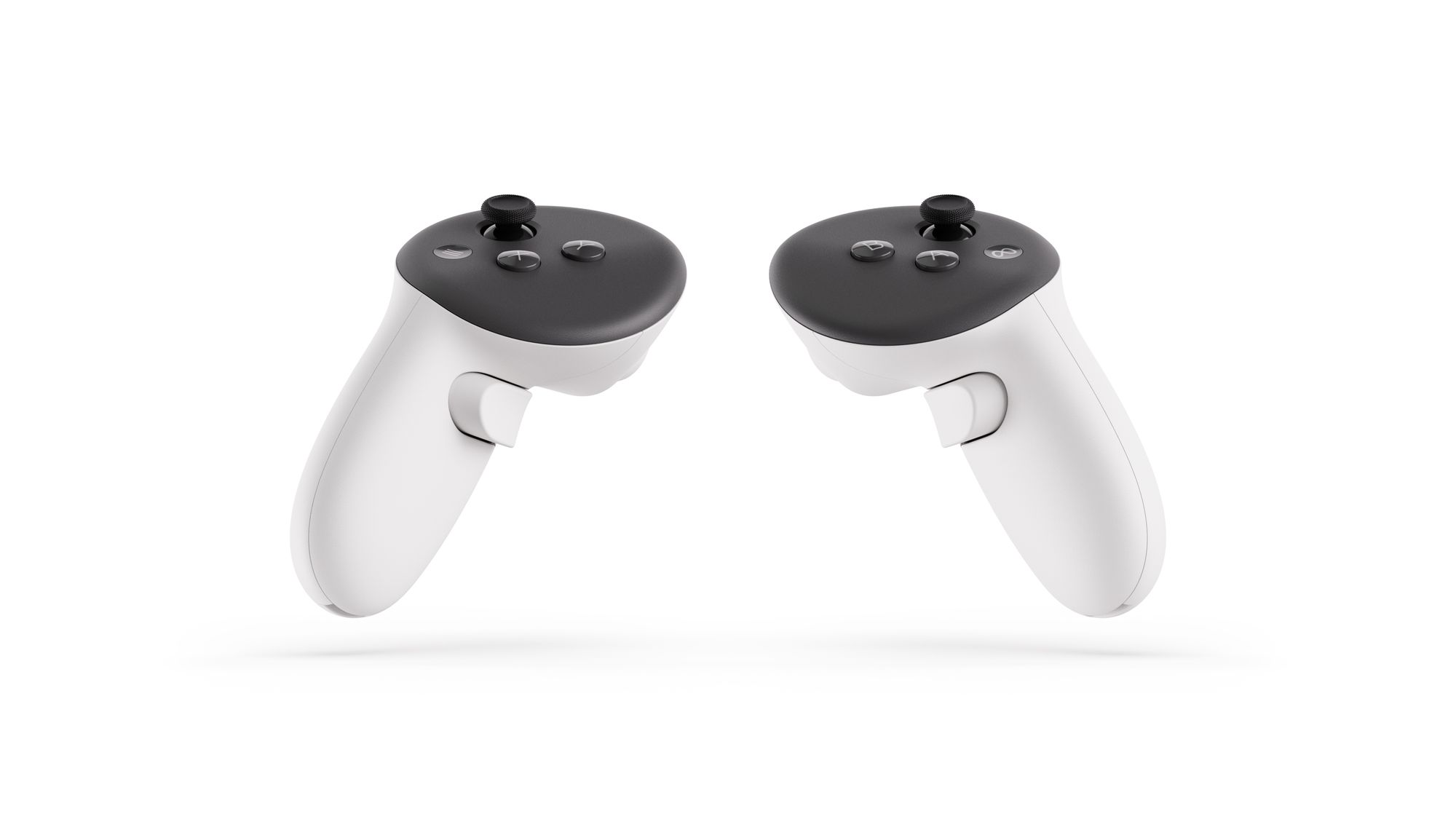
What I was most skeptical about before trying Quest 3 was not the headset itself, but its new Touch Plus controllers. They ditch the IR LED rings of previous low cost Touch controllers, but unlike Touch Pro, they aren’t self-tracking and don’t have cameras. Instead, they have IR LEDs under the face.
In theory, this should lead to frequent tracking loss when the face of the controller isn’t facing the headset. But in my demo that wasn’t the case at all. Even when I intentionally completely inverted the controllers, they continued to track flawlessly. That’s because on Quest 3 hand tracking is constantly running alongside controller tracking, and the system fuses both inputs together.
The controller-free hand tracking felt noticeably improved over Quest 2 and Pro, with almost no jitter or delay and impressive accuracy. Using Direct Touch to scroll through and press buttons on the system interface no longer had the slightly-off janky feeling it does on previous headsets, for example. Meta will also be adding upper body tracking – wrists, elbows, shoulders, and torso – in a software update later this year.
The one regression I did see with controller tracking on Quest 3 was a slightly longer re-acquisition time when bringing the controllers back into view from a wide angle while the face of the controller is occluded. That’s probably because what’s really being re-acquired in this case is the hands, and detecting arbitrary human hands seems to take longer than detecting a known pattern of bright LEDs.
Automatic Boundary
Almost everyone who owns a Quest 2 agrees that the most annoying part of the experience is having to constantly redraw the safety boundary when you just want to jump into VR as quickly as possible. Even if Quest 2 could reliably remember the playspace – and it can’t – that still wouldn’t help when the playspace has meaningfully changed since the last time you used VR.
Quest 3 instead generates a 3D mesh of your environment. It takes just a few seconds and all you need to do is pan your head around the room. The mesh is mostly for mixed reality, but the headset also uses it to automatically suggest a boundary, which you can accept with one click – much simpler than manually drawing it and closer to John Carmack’s vision of “instant VR”.
But the quality of the 3D mesh on Quest 3 left me wondering, what exactly is the point of the traditional boundary anymore? Rather than a floor-to-ceiling grid wall, I’d far prefer to just see the 3D mesh itself when I get near it, which would let me expand my VR play area to include the space above my couch, desks, or bed. Meta engineers suggested this is something they’re looking into, but that doing it right would require carefully thinking through the safety concerns.
Should You Preorder Quest 3?
A short controlled preview at a company-hosted event is insufficient to give confident purchasing advice. If you can, I’d recommend waiting for our full review which we’ll publish when Quest 3 launches on October 10.
That said, I came out of my Quest 3 demo with essentially the opposite view as my Quest Pro demo last year. Quest Pro felt like a niche sidegrade struggling to justify its price, while Quest 3 – while $200 more expensive than its predecessory – genuinely felt like the clear future of mainstream standalone XR.
If you’re a regular Quest 2 user, buying a Quest 3 could breathe new life into VR for you, and if you’ve been waiting for headsets to get smaller and better before jumping in, Quest 3 seems to eliminate major pain points and crosses a quality barrier I imagine will usher a new wave of people into this industry.
